Our Company
Locations
Contact Us
Newsletter
Sign up to receive email updates on the latest products, collections and campaigns.
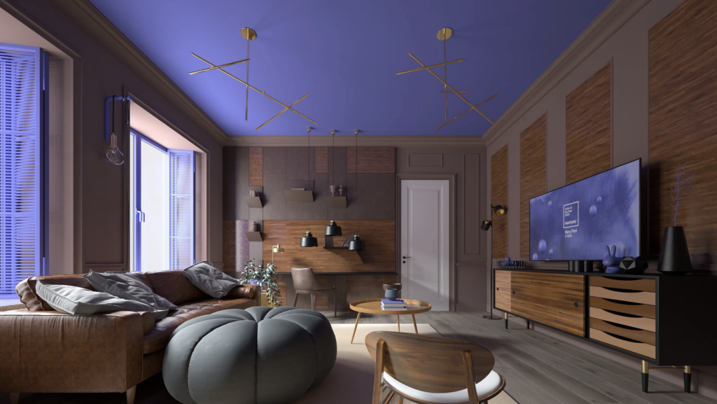
So, 2022 debuted in Veri Peri, according to PANTONE. For more than two decades, the Pantone Color Institute has established itself as the global color trend-setter.
Thus, every year, companies related to fashion, industrial design, architecture, and advertising look forward to this choice to color fabrics, products, appliances, furniture, and even buildings with the PANTONE shade of the season.
However, choosing the shade of the year is not just about imposing a color. With the presentation of each color, PANTONE promotes a feeling, an energy that is tied to the hue.
For example, in 2021 the PANTONE palette chose two colors: Illuminating (yellow) and Ultimate Gray (gray), which the company defined as shades that would act as “an engine of hope and strength in a world full of uncertainty due to the pandemic and the health crisis” and, according to the same company, this combination “sought to inspire the feeling of regeneration and doing new things.”
What Very Peri brings
The company’s press release says that Very Peri (a color close to violet) is a shade that shows “carefree confidence and a daring curiosity that animates our creative, inquisitive and intriguing spirit that helps us to embrace this altered landscape of possibilities, opening us up to a new vision as we rewrite our lives.” PANTONE explains that in this color the gratitude represented by the blue comes together, which is complemented by an exciting violet-red that creates a hue with a perspective that resonates with the present day, so Very Peri presents the future in a new light.
The press release also stated that the color of 2022 is symbolic of the spirit of our current global era and the transition we are going through. “As we emerge from an intense period of isolation, our notions and standards are changing, and our physical and digital lives have merged in new ways.”
Therefore, Very Peri is both the color of the new reality, the metaverse, and the growing artistic community in the digital space, as PANTONE believes it illustrates the fusion of modern life in both the digital and physical worlds.
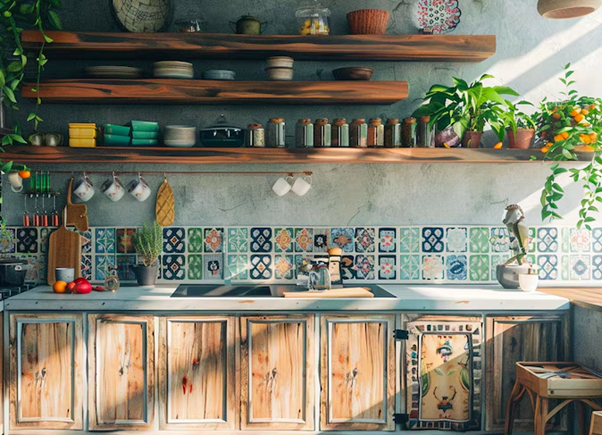
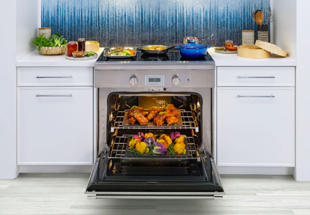
How to use 2022 PANTONE color in the kitchen
Very Peri can seem like a challenging color to integrate into the design of spaces like the kitchen. In this regard, Leatrice Eiseman, executive director of the PANTONE Color Institute recommends “taking the first step and using this great color on one wall instead of all four.”
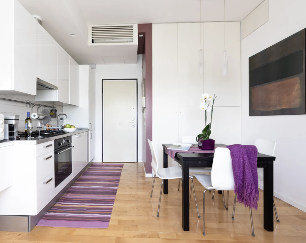
In addition to this, some experts in the field indicate that Very Peri is easy to combine. White, wood, glass, and neutral colors mixed with this shade guarantee luminous spaces that will seem visually larger.
However, walls and furniture are not the only way to integrate this PANTONE color into the kitchen palette. The color of 2022 can be introduced to this space of the home through fabrics such as rugs and tablecloths, art objects, and lamps of this color, which will not only give a very sophisticated flair to the space but also make it trendy by including the color of the year.